We divided our key findings into three separate parts, one for each dataset inspected. First, to explore demographic trends we investigated the database of opioid overdoses. Then, we compared that information with that within the healthcare spending dataset. Finally, we compared the overdose statistics to the unemployment information.
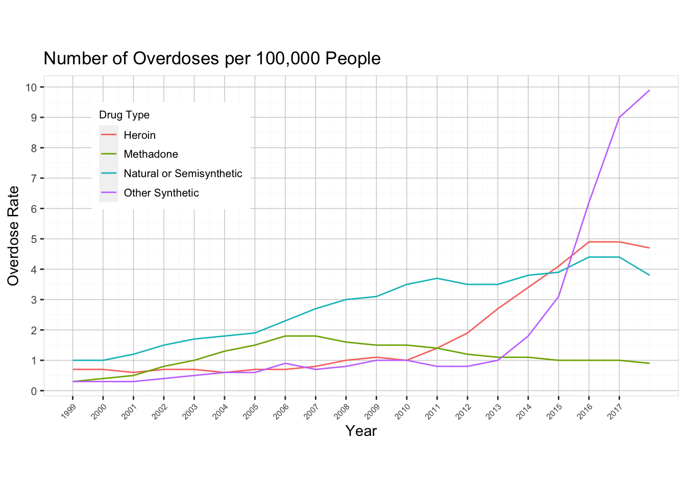
Below is a line plot which graphs the rate of overdoses by drug type for the 19 year span between 1999 and 2017. The y-axis shows the number of people who passed away for a given population of 100,000 individuals. By investigating a rate instead of a total, we can ignore the effect of the growing population.
One of the research questions we were interested in solving was whether or not the CDC was correct about the three distinct spikes. They claimed that there was a dramatic rise in heroin use in 2010, and another such rise in synthetic opioids in 2013. Unfortunately, our dataset does not go back to the 1990’s so we cannot see about the rise of prescription drug abuse. However, there are clearly dramatic inclines for heroin (red line) and synthetic opioids (cyan line) on the specified years. So we can conclusively say that the CDC was valid with their assertion.
3.2 Demographic Trends
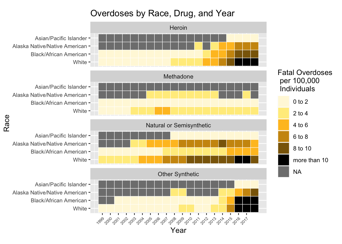
We were also interested in exploring whether or not race played any part in abuse patterns. Below is a heat map, faceted by drug type, that shows the fatality rates for each of four races (white, black/African American, Alaska Native/Native American, Asian/Pacific Islander).
Unfortunately, the demographic data was missing information for Asian/Pacific Islander and Alaska Native/Native American so we cannot make meaningful insights about these groups over time. The most deadly pattern displayed is heroin and synthetic opioid abuse in the years after 2015. These years saw many fatalities for members belonging to the white, black, and Alaska Native/Native American groups. Closely following those two drugs in total deaths is natural/semisynthetic opioids. These drugs had a consistent rate of casualties since about 2003, increasing slightly over time. From this data, we can observe slight discrepancies between abuse patterns among different races, but it is clear that the opioid crisis affects people of all ethnicities.
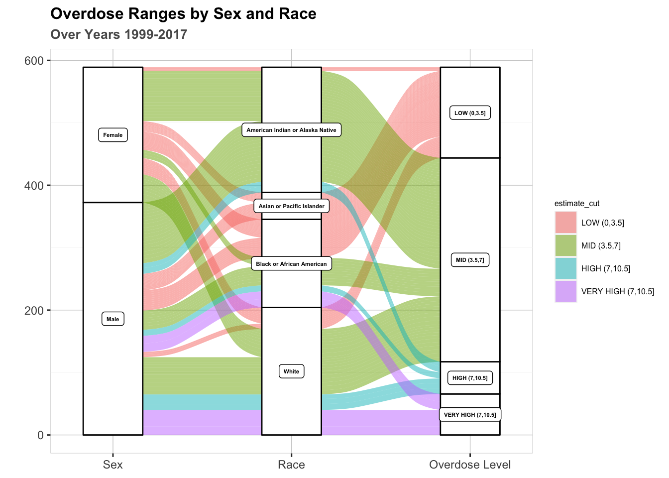
Below is an alluvial graph that illustrates relationships between gender, race, and overdose rate. The color of each flow represents a severity level (detailed in the legend). The thickness of each flow represents the number of years that a demographic trend has been observed. In other words, a thick line is indicative of a persistent trend over multiple years.
Code
library(ggalluvial)ggplot(data = drug_sr1,aes(axis1 = Sex, axis2 = Race,axis3 = estimate_cut, y = m)) +geom_alluvium(aes(fill=estimate_cut)) +geom_stratum() +geom_label(stat ="stratum", aes(label=after_stat(stratum)), fontface ="bold", size =1.5) +scale_x_discrete(limits =c("Sex", "Race", "Overdose Level"),expand =c(0.15, 0.05)) +ggtitle("Overdose Ranges by Sex and Race", sub ="Over Years 1999-2017") +ylab("") +theme(legend.title =element_text(size =6), legend.text =element_text(size =6)) +theme(plot.title =element_text(face ="bold", size =12)) +theme(plot.subtitle =element_text(face ="bold", color ="grey35", size=10)) +guides(color=guide_legend(title="Drug Type")) +theme(panel.background =element_rect(fill ='white', color ='gray80', size=0.25),panel.grid.major =element_line(color ='gray80', size =0.25),panel.grid.minor =element_line(color ='gray95', size =0.1))
This graph presents interesting results gender-wise. It is evident that men encapsulate the entirety of the “high” and “very high” severity bins, mainly white and black men (see light blue and purple flows in graph). This result could point to a systematic issue that causes men to fall victim to addiction. That being said, a sizable amount of American Indian/Alaska Native women rates fall into the “moderate” category. Why does this ethnic group have disproportionately more female fatalities than every other ethnic group? Perhaps marginalized ethnic groups don’t have as much access to preventative and/or life-saving measures.
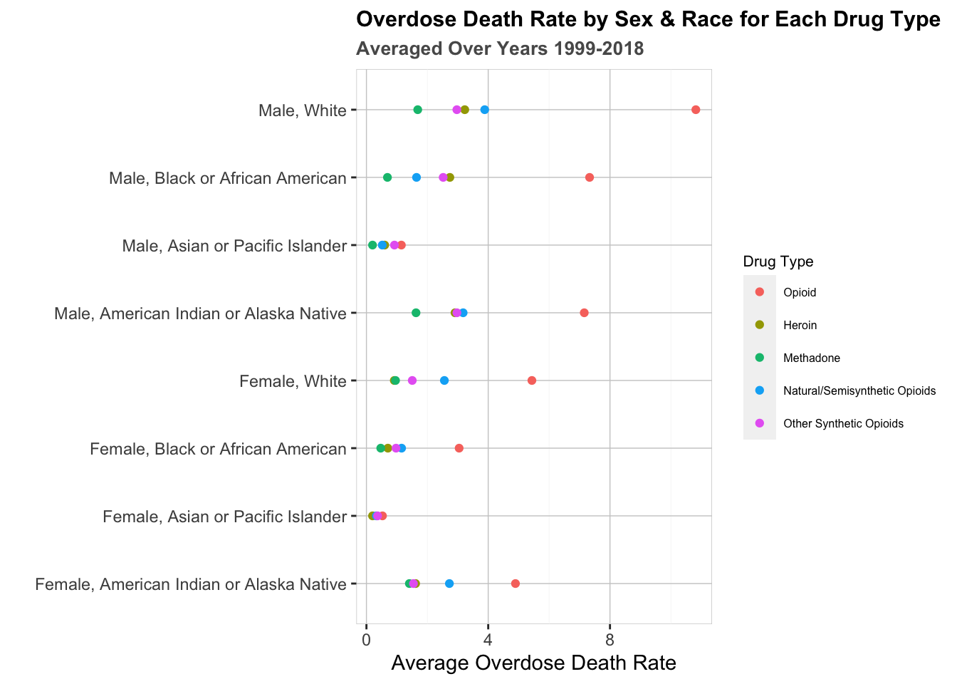
See the Cleveland Dot Plot below to further explore potential gender and race based trends, subdivided by drug type.
drug_sr2$Sex_Race <-paste(drug_sr2$Sex, drug_sr2$Race, sep =", ")drug_sr2 <-subset(drug_sr2, PANELS !='All')dotplot <-ggplot(drug_sr2, aes(m, Sex_Race, color = PANELS)) +geom_point() +ggtitle("Overdose Death Rate by Sex & Race for Each Drug Type", sub ="Averaged Over Years 1999-2018") +ylab("") +xlab('Average Overdose Death Rate') +scale_x_continuous(breaks =seq(0, 20, by =4)) dotplot <- dotplot +guides(shape =guide_legend(override.aes =list(size =0.9)))dotplot <- dotplot +guides(shape =guide_legend(override.aes =list(size =0.9)))dotplot <- dotplot +theme(legend.title =element_text(size =8), legend.text =element_text(size =6)) +theme(plot.title =element_text(face ="bold", size =11.5)) +theme(plot.subtitle =element_text(face ="bold", color ="grey35", size=10)) +theme(plot.caption =element_text(color ="grey68")) +theme(panel.background =element_rect(fill ='white', color ='gray80', size=0.25),panel.grid.major =element_line(color ='gray80', size =0.25),panel.grid.minor =element_line(color ='gray95', size =0.1))dotplot <- dotplot +guides(color=guide_legend(title="Drug Type"))dotplot
Here we can see the overdose data broken down by race, gender, and drug type. Our initial observation is that white men have incurred the highest rate of total opioid-related fatalities. After that, black/African American and American Indian/Alaska native males are about equal at seven fatalities per 100,000 individuals. This data backs up the findings discovered in the alluvial diagram above. What does this graph show us about the type of drug affecting each demographic the most? Well, five of the eight groups suffer the most from natural/semisynthetic opioid abuse. To see why this is so, revisit the heat map above. While other categories of drugs have become incredibly deadly in recent years, natural/semisynthetic drugs have been a persistent issue since the early 2000’s. On the other side of the spectrum, methadone is almost unanimously the least deadly drug among different demographics. In conclusion, every demographic suffers from some combination of the narcotic categories. Each breakdown may differ slightly, but addiction does not take mercy on any one ethnicity or gender.
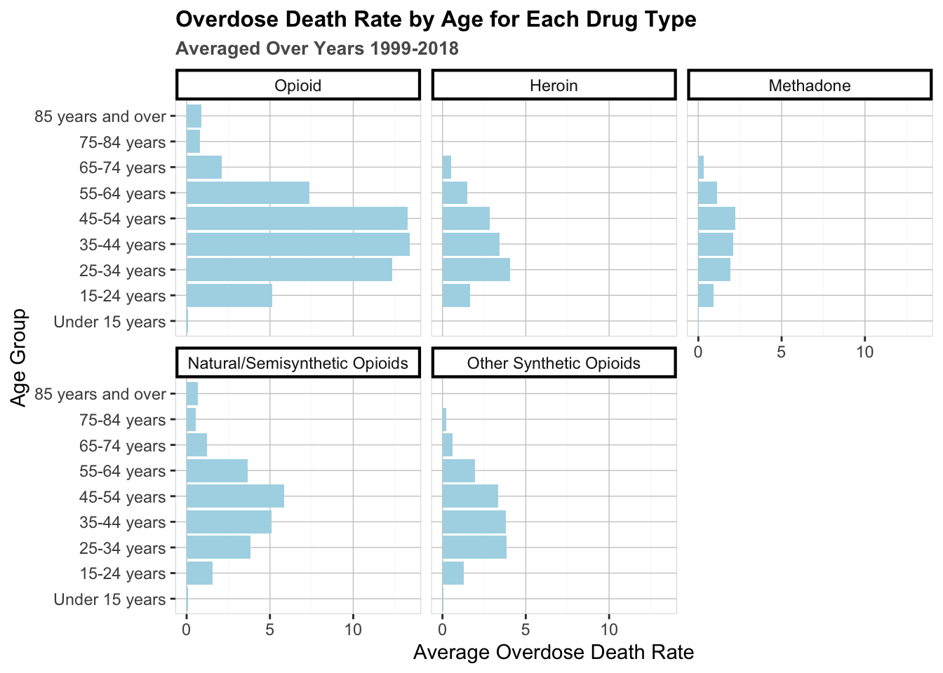
Does age play a role in addiction patterns? Below is a set of bar graphs that illustrate the rates at which age groups fall victim to fatal opioid overdoses, faceted by drug type. These rates are averaged over the 19 year span between 1999 and 2017.
Code
drug_age <- drug %>%drop_na()colnames(drug_age)[2] ="PANELS"drug_age <-subset(drug_age, PANELS !='All drug overdose deaths'& STUB_NAME =='Age')drug_age <- drug_age %>%group_by(AGE, PANELS) %>%summarize(m =mean(ESTIMATE)) %>%ungroup()drug_age$PANELS <-factor(drug_age$PANELS, levels =c( "Drug overdose deaths involving any opioid", "Drug overdose deaths involving heroin", "Drug overdose deaths involving methadone", "Drug overdose deaths involving natural and semisynthetic opioids", "Drug overdose deaths involving other synthetic opioids (other than methadone)"), labels =c("Opioid", "Heroin", "Methadone", "Natural/Semisynthetic Opioids", "Other Synthetic Opioids"))drug_age$AGE <-factor(drug_age$AGE, ordered =TRUE, levels =c("Under 15 years", "15-24 years", "25-34 years", "35-44 years", "45-54 years", "55-64 years", "65-74 years", "75-84 years", "85 years and over", "All ages", labels =c("Under 15", "15-24", "25-34", "35-44", "45-54", "55-64", "65-74", "75-84", "Over 85", "All Ages")))bar <-ggplot(drug_age, aes(m, AGE)) +geom_bar(stat ='identity', fill ='lightblue') +facet_wrap(~PANELS) +theme(strip.background =element_rect(color="black", fill="white", size=1.5, linetype="solid")) +ggtitle("Overdose Death Rate by Age for Each Drug Type", sub ="Averaged Over Years 1999-2018") +xlab("Average Overdose Death Rate") +ylab("Age Group") +theme(plot.title =element_text(face ="bold", size =12)) +theme(plot.subtitle =element_text(face ="bold", color ="grey35", size=10)) +theme(plot.caption =element_text(color ="grey68")) +theme(panel.background =element_rect(fill ='white', color ='gray80', size=0.25),panel.grid.major =element_line(color ='gray80', size =0.25),panel.grid.minor =element_line(color ='gray95', size =0.1))bar
First let’s take a closer look at the cumulative “Opioid” graph. The fatality rates are approximately normally distributed around the age of 45, skewed toward older ages. After the age of 64, overdose rates fall dramatically. There appears to be an incredibly small fatality rate for children under the age of 15. Now let’s inspect age trends for each drug type. Interestingly, heroin and synthetic opioids are the largest issue for those 25 to 44 years of age, while methadone and natural/semisynthetic affect those who are 45 to 54 years old. In fact, natural/semisynthetic opioiods affect people older than 65 more than every other drug combined. Why does the distribution of fatalities among the different age groups vary by drug? We cannot answer this for sure, but perhaps knowing these distributions can help us to alleviate the opioid crisis by showing us where to direct preventative resources (highschools, colleges, workplaces, nursing homes, etc).
3.3 National Health Expenditures
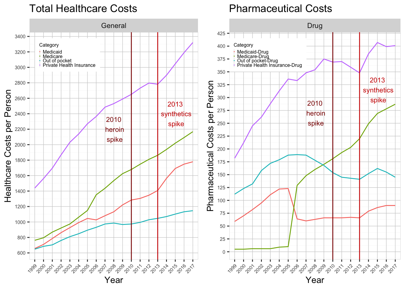
In this section, we will look at graphs that display trends between drug fatalities and the cost of healthcare in the United States. The reason we chose this specific topic was by asking ourselves what external factors may cause individuals to abuse drugs. We hypothesized that people would self-medicate using narcotics more if the price of healthcare was too expensive. Below are two line plots, one which displays the average cost of healthcare per person, and the other which shows the average cost of prescription drugs per person. This information was calculated by extracting healthcare spending data from the NHE database and dividing by the US population for each year. The result shows how much money was spent, on average, by each person in the country.
We have included vertical lines to mark the rise in heroin and sythetics in the years 2010 and 2013, respectively. One pattern that jumped out at us was in the year 2013, when the cost of private health insurance skyrocketed, both in general and in pharmaceutical payments. The NHE defines this category as “the net cost of private health insurance which is the difference between health premiums earned and benefits incurred”. Interestingly, the boom in health insurance prices in 2013 reflects a similar rise in synthetic opioid abuse. It is our contention that this inflated cost of care caused people to seek alternate solutions to medicate themselves, namely narcotics. However, correlation does not prove causation and these results may simply be coincidental. The other three categories (Medicare, Medicaid, and out of pocket expenses) do not provide us with any meaningful takeaways on the financial toll incurred by the population of this country.
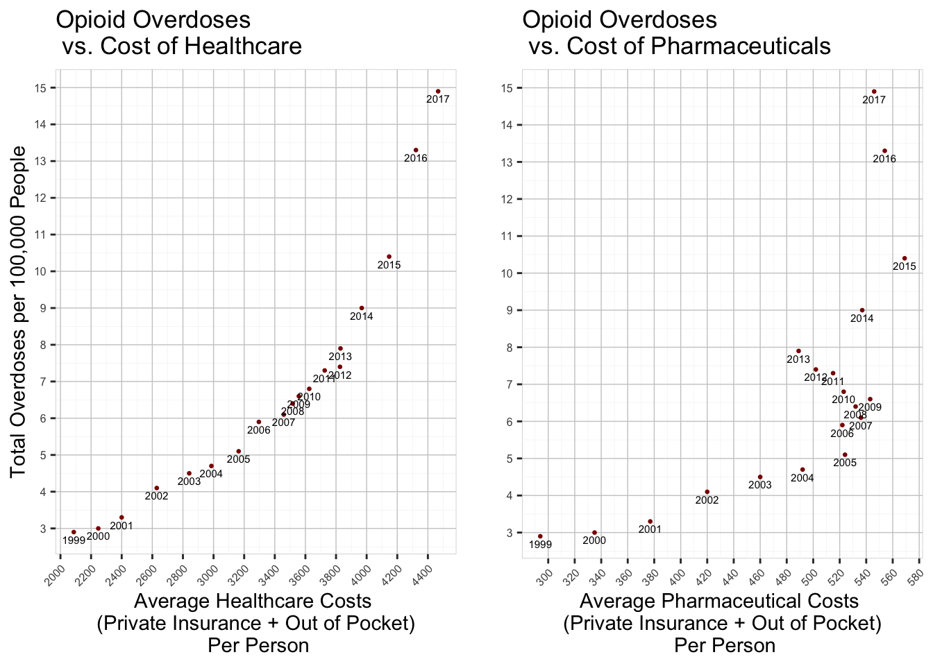
Below we created two scatterplots to see if there is any discernible correlation between the cost of healthcare/pharmaceuticals and the overdose rate for opioids.
Code
drug_all <- drug[ which(drug$STUB_NAME=='Total'& drug$UNIT =='Deaths per 100,000 resident population, age-adjusted'& drug$PANEL_NUM ==1), ]drug_all <-filter(drug_all, YEAR !="2018")expenditures_drug <-filter(nhe_long, Category =="Out of pocket-Drug"| Category =="Private Health Insurance-Drug")expenditures_drug <- expenditures_drug %>%group_by(Year) %>%summarize(drug_spending =sum(Amount),.groups ='drop') expenditures_all <-filter(nhe_long, Category =="Out of pocket"| Category =="Private Health Insurance")expenditures_all <- expenditures_all %>%group_by(Year) %>%summarize(healthcare_spending =sum(Amount),.groups ='drop')combined <-bind_cols(drug_all['ESTIMATE'], drug_all['YEAR'], expenditures_all['healthcare_spending'], expenditures_drug['drug_spending'], pop1['POPTOTUSA647NWDB'])p1 <-ggplot(combined, aes(x= healthcare_spending, y= ESTIMATE, label=YEAR))+geom_point(size=0.5, color="red4") +geom_text(size=2, hjust=0.5, vjust=1.5) +scale_x_continuous(n.breaks =15, breaks=waiver()) +scale_y_continuous(breaks =seq(0,15,1)) +theme(panel.background =element_rect(fill ='white', color ='gray80', size=0.25),panel.grid.major =element_line(color ='gray80', size =0.25),panel.grid.minor =element_line(color ='gray95', size =0.1),axis.text.x =element_text(angle=45, hjust=1,size=6),axis.text.y =element_text(angle=0, hjust=1,size=6)) +labs(title="Opioid Overdoses \n vs. Cost of Healthcare",y="Total Overdoses per 100,000 People",x="Average Healthcare Costs \n(Private Insurance + Out of Pocket)\n Per Person")p2 <-ggplot(combined, aes(x= drug_spending, y= ESTIMATE, label=YEAR))+geom_point(size=0.5, color="red4") +geom_text(size=2, hjust=0.5, vjust=1.5) +scale_x_continuous(n.breaks =15, breaks=waiver()) +scale_y_continuous(breaks =seq(0,15,1)) +theme(panel.background =element_rect(fill ='white', color ='gray80', size=0.25),panel.grid.major =element_line(color ='gray80', size =0.25),panel.grid.minor =element_line(color ='gray95', size =0.1),axis.text.x =element_text(angle=45, hjust=1,size=6),axis.text.y =element_text(angle=0, hjust=1,size=6)) +labs(title="Opioid Overdoses \n vs. Cost of Pharmaceuticals",y ="",x="Average Pharmaceutical Costs \n(Private Insurance + Out of Pocket)\n Per Person")grid.arrange(p1,p2, nrow=1)
Code
corr1 <-cor(combined$ESTIMATE, combined$healthcare_spending)print(paste("Correlation coefficient for healthcare spending and overdoses: ", corr1))
[1] "Correlation coefficient for healthcare spending and overdoses: 0.914776421295715"
Code
corr2 <-cor(combined$ESTIMATE, combined$drug_spending)print(paste("Correlation coefficient for pharmaceutical spending and overdoses: ", corr2))
[1] "Correlation coefficient for pharmaceutical spending and overdoses: 0.692457900045326"
Each point represents a year in the time frame between 1999 and 2017. On the x-axis is the average cost of healthcare/prescription drugs per person. This value is the sum of out-of-pocket costs and health insurance costs. The y-axis is the rate of opioid-related fatalities per 100,000 individuals. Using the correlation function in R, we were able to determine that there is a 91% correlation between healthcare spending and fatality rates. We also determined that there is a 69% correlation between pharmaceutical spending and fatality rates. These trends may be coincidental, or they could point to a systematic issue within the United States healthcare system that neglects the less fortunate.
3.4 National Unemployment Rate
Last, we were interested in seeing if the national unemployment rate had any correlation with the rate of overdoses. According to research conducted by the Suicide Prevention Resource Center, “People who were unemployed were more than 16 times as likely to die by suicide as people with jobs” [1]. This being the case, we believed that there would be a positive correlation between the national unemployment rate and the overdose rate. Below is a scatterplot that compares the two rates, where each point represents a year from 1999 to 2017. This plot is interactive, so you can hover over a point to see which year it represents.
Code
drug_year <- drug %>%drop_na()drug_year <-subset(drug_year, UNIT=='Deaths per 100,000 resident population, age-adjusted'& STUB_NAME =='Total'& PANEL =='Drug overdose deaths involving any opioid'& YEAR <=2017)unemployment <-read_csv("~/Downloads/unemployment.csv", show_col_types =FALSE)annual <-rowMeans(unemployment[, 2:13], na.rm=T)unemployment$Annual <- annualdrug_year <-cbind(drug_year, unemployment$Annual)colnames(drug_year)[16] ="unemployment"drug_year$unemployment <-round(drug_year$unemployment ,digit=3)
Code
suppressPackageStartupMessages(library(plotly, warn.conflicts =FALSE))suppressPlotlyMessage <-function(p) {suppressMessages(plotly_build(p))}fig <-plot_ly(drug_year, x =~ESTIMATE, y =~unemployment, marker =list(size =10,color ='rgba(255, 182, 193, .9)',line =list(color ='rgba(152, 0, 0, .8)',width =2)), text =~paste("Year: ", YEAR, '<br>Unemployment:', unemployment, '<br>Overdose Death Rate:', ESTIMATE)) %>%layout(title ='Unemployment vs Overdose Death Rate', xaxis =list(title ='Average Overdose Death Rate'), yaxis =list(title ='Average Unemployment Rate'))suppressPlotlyMessage(fig)
Code
corr3 <-cor(drug_year$ESTIMATE, drug_year$unemployment)print(paste("Correlation coefficient for unemployment and overdoses: ", corr3))
[1] "Correlation coefficient for unemployment and overdoses: 0.0496637809558611"
Initial inspection shows that there doesn’t seem to be any discernible correlation between the unemployment rate and and the overdose rate. Using R, we have calculated that these two sets of data are 5% correlated (r=0.0497), meaning that an increase in unemployment doesn’t necessarily correspond to an increase in overdoses. While this may be the case on a national scale, it is important that we heed the warning of the Suicide Prevention Resource Center and offer support to our friends and families who are unemployed.